
Japandi Interior Design: What It Actually Is and How AI Gets It Right
Japanese spatial discipline meets Nordic warmth. Why Japandi dominates design searches, and how AI renders it better than you might expect.
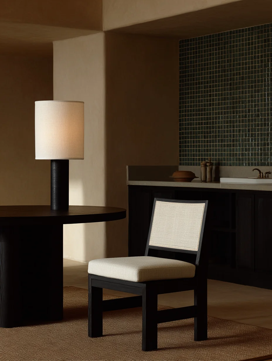
Japandi has been the most searched interior design style on Pinterest and Google for three consecutive years. That kind of staying power moves it out of 'trend' territory and into something more permanent: a genuine design language that resonates across cultures.
The word itself is a portmanteau. Japanese + Scandinavian. But reducing it to a blend misses what makes it work. Both traditions share a deep respect for natural materials, empty space, and objects that earn their place in a room. They arrive at similar conclusions from very different starting points.
What defines Japandi
The Japanese contribution is spatial discipline. Ma - the concept of meaningful emptiness - shapes how a Japandi room breathes. Every object exists in relationship to the space around it. Furniture sits low. Surfaces stay clear. The room itself is the design, not the objects in it.
The Scandinavian contribution is warmth. Nordic design fights darkness and cold with light wood, soft textiles, and layered lighting. Where pure Japanese minimalism can feel austere, the Scandinavian influence makes Japandi spaces feel lived-in without feeling cluttered.
- Materials: light oak, ash, walnut, linen, raw ceramic, stone, washi paper
- Palette: warm neutrals, muted earth tones, occasional deep charcoal or forest green
- Furniture: low profiles, clean lines, visible joinery, no ornament
- Lighting: diffused and layered, paper lanterns, indirect sources, no exposed bulbs
- Texture: matte finishes, hand-thrown ceramics, raw linen, woven rattan
Why AI renders Japandi well
Most AI interior design generators struggle with maximalist styles because they lose spatial coherence - too many objects, too many competing patterns. Japandi is the opposite. Its restraint gives the AI a clear material vocabulary and strong compositional rules. The result is that AI-generated Japandi interiors are often indistinguishable from professional photography.
Gaia's Interior AI includes Japandi as one of its core styles, calibrated against real projects rather than generic mood boards. The material palette is specific: actual timber species at correct scales, ceramic glazes that read as hand-thrown, textiles with visible weave. It is one of the styles where AI rendering has genuinely reached professional quality.
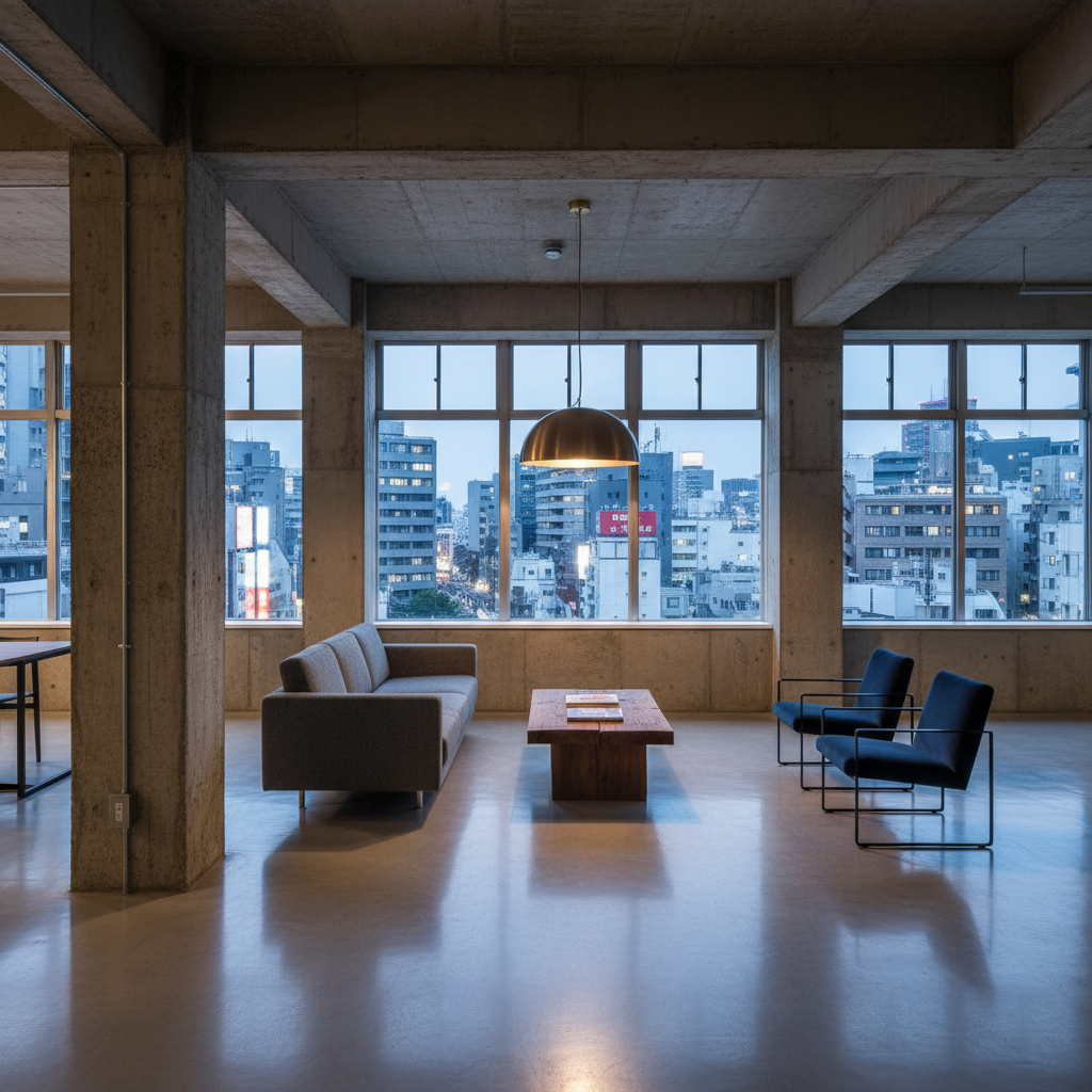
Common mistakes
The most common Japandi mistake is treating it as 'minimalism with wood.' Authentic Japandi has imperfection baked in. The wabi-sabi influence means a hand-thrown ceramic bowl matters more than a perfectly symmetrical one. A table with visible grain and natural edge reads better than a lacquered slab.
Another frequent error: too much white. Japandi leans warm, not clinical. Think parchment, oatmeal, warm grey, clay - not hospital white. The Scandinavian influence brings light, not sterility.
Try it
Upload a photo of any room to Gaia's Interior AI and select Japandi from the style menu. You will get four photorealistic variations in about 20 seconds. The Style Quiz can also help determine whether Japandi matches your broader design instincts.